Task 1: Group items in the list view
Before I can tackle the complexity of grouping items in the grid view, I first had to add grouping feature to the list view. This led to the creation of a new widget : GroupedListWidget. The widget only does one level of grouping, i.e., no nested groups.
The widget is unaware of the entire metadata of its entries, and only knows about the values of attribute on which to perform the grouping (as long as those values are strings). This attribute values list needs to be passed from the dialog. This gives the widget some flexibility in case it is to be used elsewhere.
First I grouped the entries within the code using hashmaps, then created a linear list out of that, making slight adjustment to its contents, and displayed it just through the existing ListWidgets draw() method.
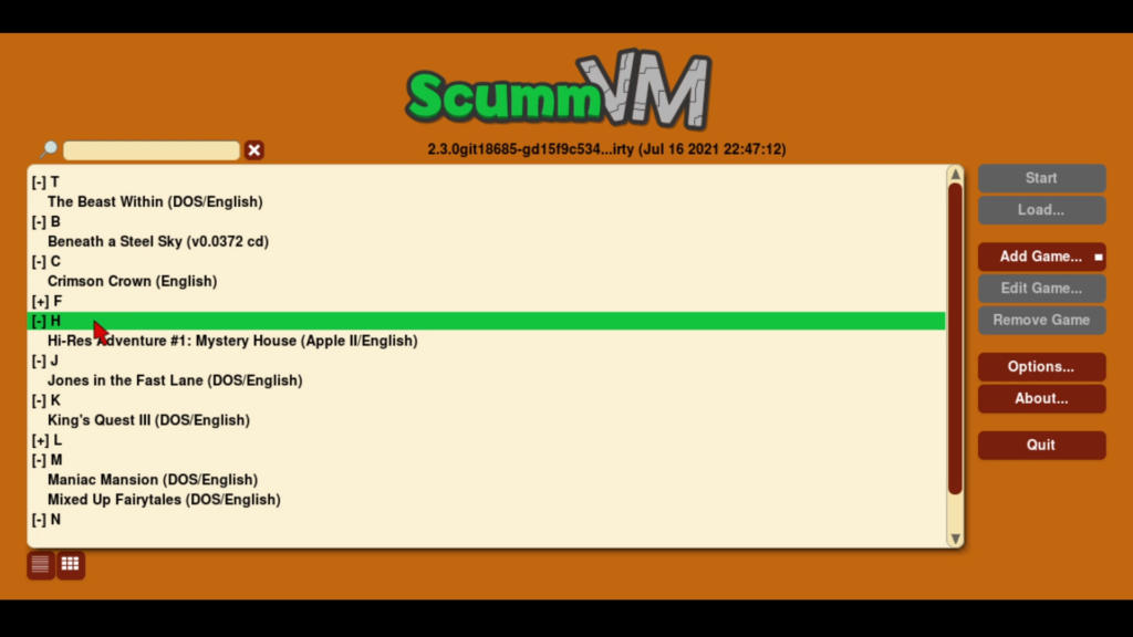
Task 2: Toggle-able groups
Groups should be able to expand and collapse. Currently I am using double click to toggle the group between those two states. As a test earlier, I had just appended a “[+]” or “[-]” to the list items string, but this is not neat as it could be confused to be the part of the string and not an icon belonging to the widget.
Here I have experimented with two designs, the one on the left is simpler in look (currently implemented with “>” and “<” chars, but later can be converted to vector symbols), but the one on the right makes it clearer that it is a symbol belonging to the widget.
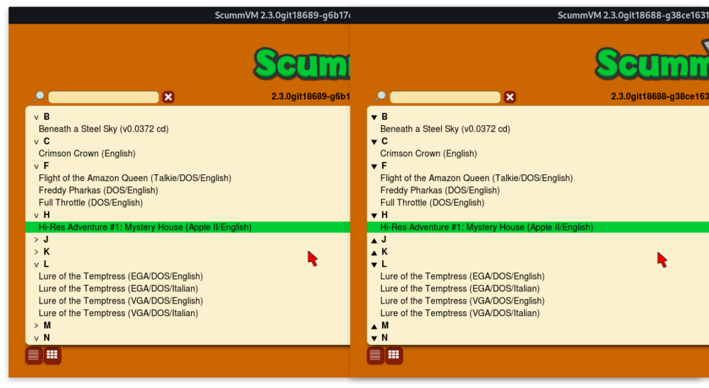
Other design aspects need to be experimented with. Should the group headers be on a differently colored background? Should the header have bigger font? etc.
Anyways, let me know in the comments which design looks better to you.