Task 1: Rendering “Groups“
I had already acquired the technology to group elements in array form, and the grid internally uses a linear array to store the entries as well. So “forming” groups is borderline copy paste.
So I can easily add a generic “attribute” parameter to the struct (which may well be some already known parameter like engineid or gameid, I don’t worry about data redundancy here). This is the attribute to form groups on.
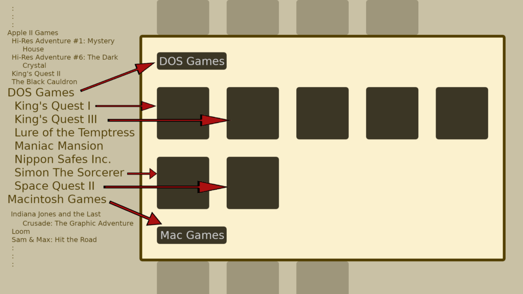
Now everything to render on the grid is arranged in the form of a list internally, so just take the grouped list and read it linearly, and convert it to a grid.
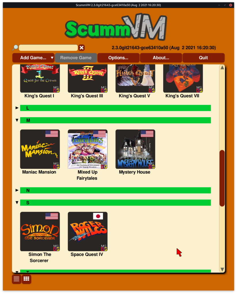
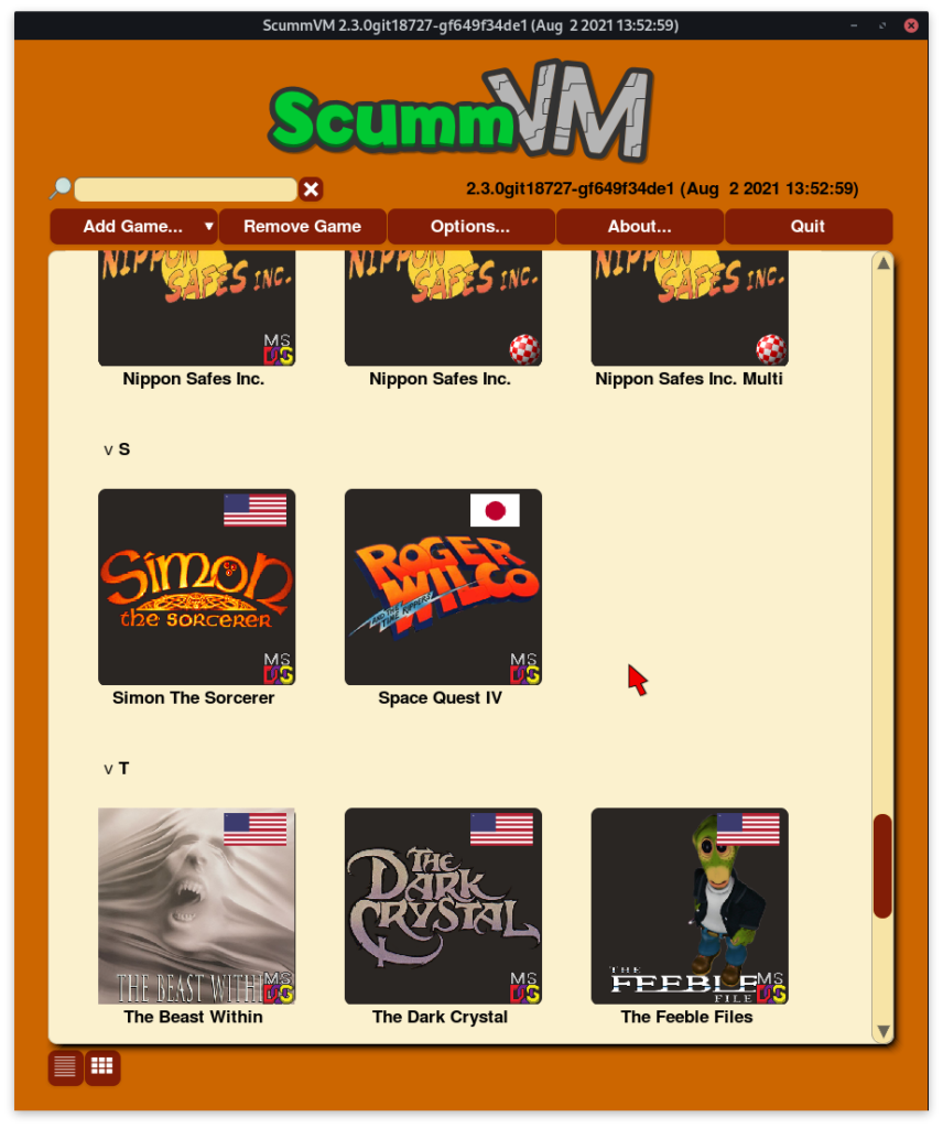
So the group rendering … works, but obviously headers are supposed to have different style, a different height, as seen in the mockup. But this simple problem of having items not have all the same height, requires us to come up with a new rendering algorithm for the grid.
Task 2: Variable height grid entries
Having all entries have the same height simplifies the calculations significantly. Just using linear maths, we can determine given a y coordinate (and the window height), exactly what elements are to be displayed. But when we don’t know beforehand the size of these entries, how do we find out given a random scroll position (y value), which entries should be drawn?
We additionally need to store the size and position (on the scrolling page, not where to render) of the entry not within the rendering widget, but within the list itself.
We run binary search to figure out the first visible item on the grid. It will have y value of just less than our scroll position. Then we interpret the list as a grid.
Then during drawWidget() function, we just a boolean to use different rendering methods to draw the different kinds of items.
Task 3: Collapsible groups, improving the look
The toggling of groups is still the same as it was in grouped list, we modify the internal array, and reinterpret the grid from that list.
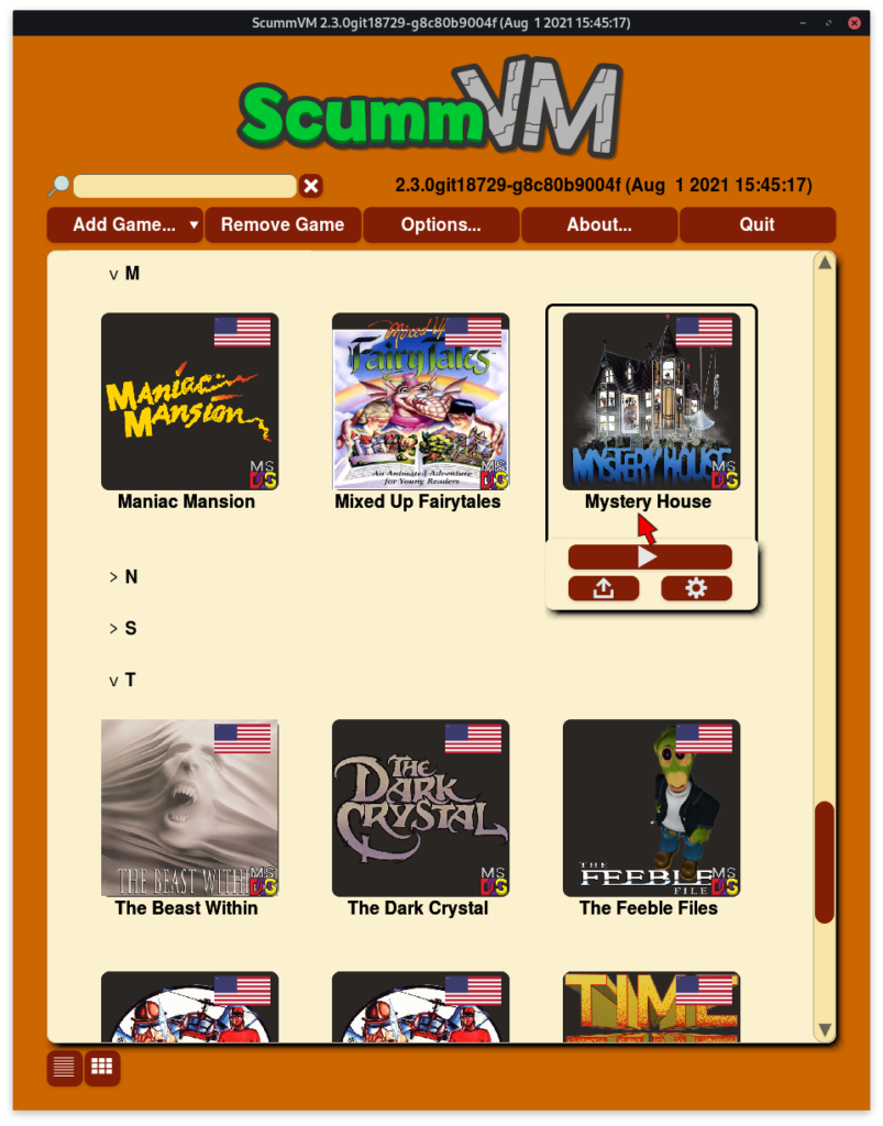
Now that we have allowed our grid items to have different heights, we can also remove the reservation of static space of two lines under the thumbnail (notice how in the above, there is one line of empty space between “Mystery House” and the tray). This was done earlier to accommodate for longer titles, but now we can dynamically allocate space for titles, we can save on vertical space where it’s not required.
Further improvement was made to the look of the headers, restoring the triangle for fold indicators, and giving them a background color (which I plan to make theme configurable) so that the distinction between groups is clear.