Task 1 : Hi, HiDPI.
One part that had been neglected up till this point has been the look of GUI on different displays, especially high density displays (HiDPI), on which the GUI is scaled 2x. I could not test this earlier because I don’t have a HiDPI display for my computer, but sev pointed out a switch in the code which I could hardcode to force 2x scaling.
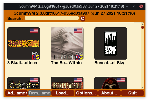
Trying to make the window smaller revealed several flaws.
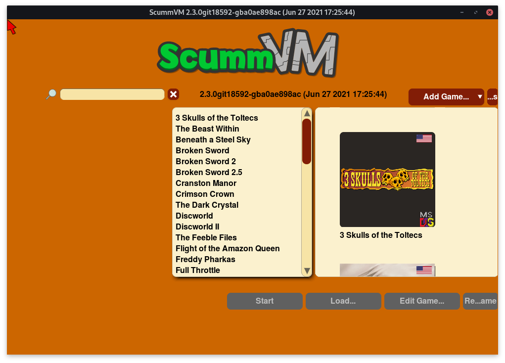
It seems that the theme file needed several adjustments before the interface looked acceptable even on non-HiDPI displays.
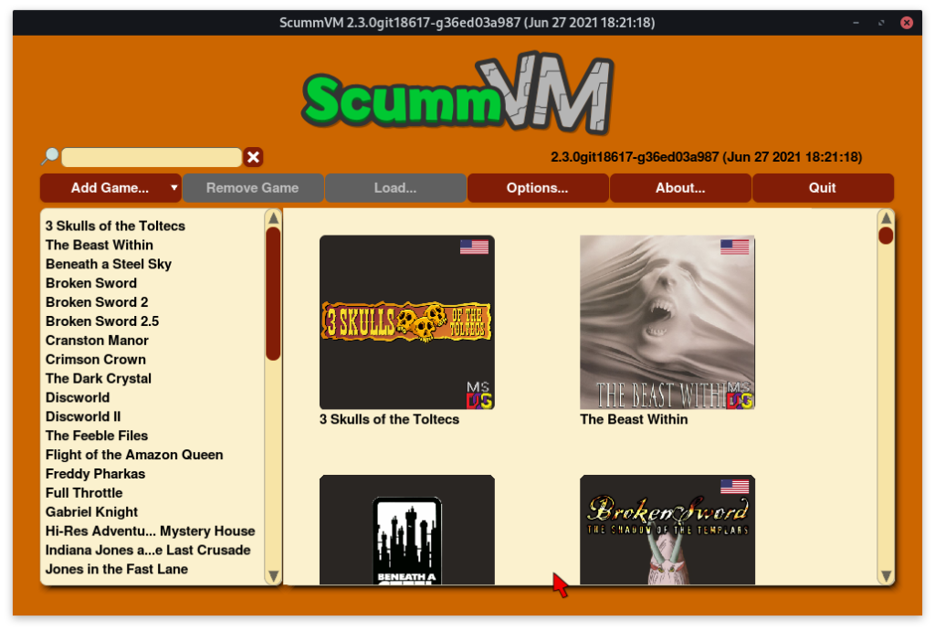
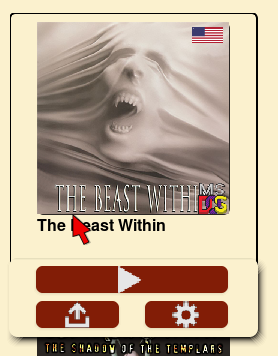
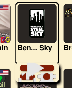
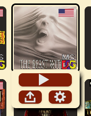
Start Game and Edit Game buttons were removed in favour of the tray icons. These were also fixed to properly display on HiDPI displays.
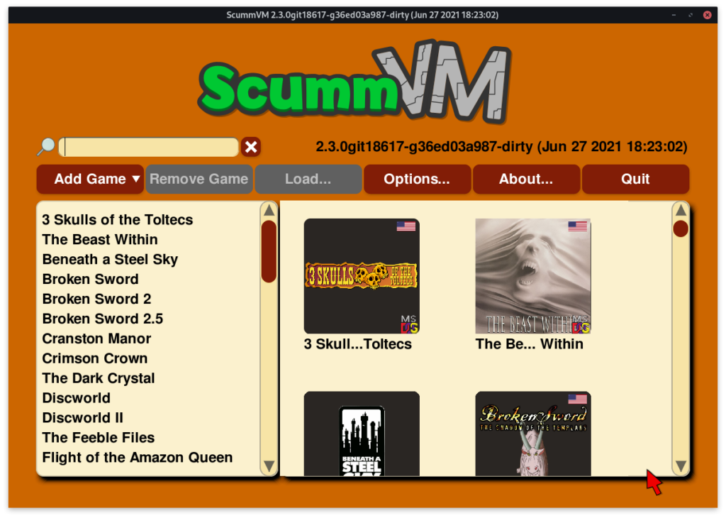
After few fixes:
Task 2 : Responsive Handling
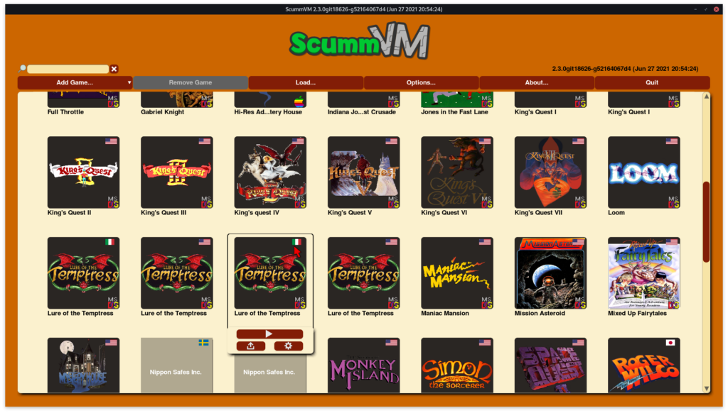
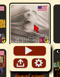
Few behaviours on grid should be intuitive. For instance, hovering over an item should highlight it, double clicking on an entry should start that game, even if the play button is not clicked, scrolling or clicking outside the entry should close the tray. These behaviours were coded. Further, we need to bring the clicked entry into focus on the grid, so the grid must be scrolled as well. In order to make it less abrupt a short sliding animation can be played. This will be implemented in the upcoming week.
A scrollbar was added to the grid which still needs some work. Placeholders are now used for missing thumbnails which are just the title displayed on the thumbnail area.
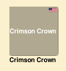
I had hardcoded loading of flags from a placeholder list, but now they are loaded according to the list of recognized languages in Language.cpp file. Similar thing is yet to be done for platforms, so I will need to seek a resource for platform icons that I can use for the project.
I also removed list from the launcher view, and will be adding a switch soon to be able to toggle back and forth between the grid and the list view, like the one in Save/Load Dialog.
Great work mate! It looks magnificent, really brings the GUI to life!
Thanks a lot! 🙂