Task 1: Fix the scrolling
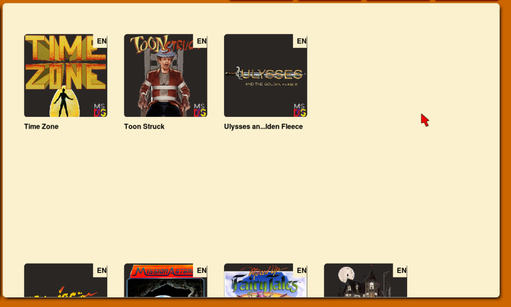
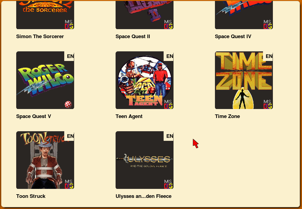
The initial implementation of scrolling was really buggy, visible entries would become desynced at points, and wrong entries would be displayed. Scrolling far enough down would break the scrolling, and resizing was janky as well.

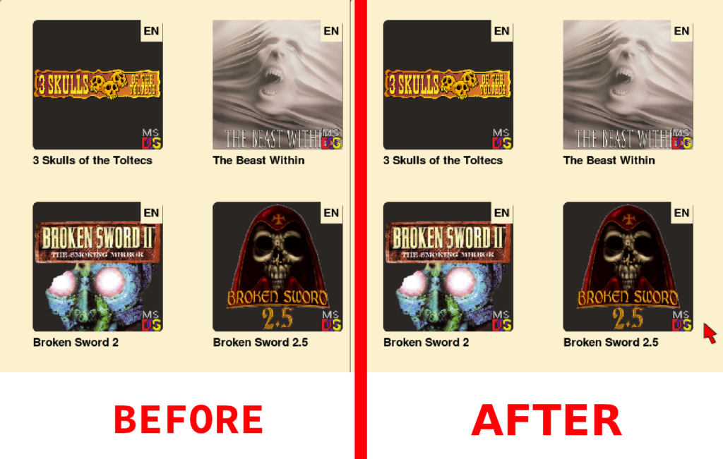
Other than scroll issues, also seen in above picture is that the items are always at constant distance from each other. So I went ahead and made the entries justify themselves in a row. UI related variables such as how close or far the columns can get, how big each entry is, what is the background color of thumbnail etc, will be exposed for user customisation through the Theme engine in due time. For now, these values remain hardcoded.

Also, the previous images/videos would not show this, but really the scrolling only worked when you scrolled on the “empty space” in the grid, as otherwise the scroll event was “caught” by the various component widgets of the items. This was also fixed.
Apart from logic changes in how scrolling works, and how the grid knows what games are visible, there were a few more things.
Interlude : The Invisible Change

I changed what the composition of a Grid Item is, so instead of containing child Widgets, the Item instead just draws the components on its own, which means that there is a potential to change the look of components like Thumbnails and Title without affecting other GraphicsWidgets or StaticTextWidgets. Of course, there is no change in how the items will look, I have just cut the bloat of creating 4 additional objects per grid item.
Task 2: Improving the look of items
Now that we have a bit more flexibility over how we draw our grid item, perhaps we can add a bit of flair to it.

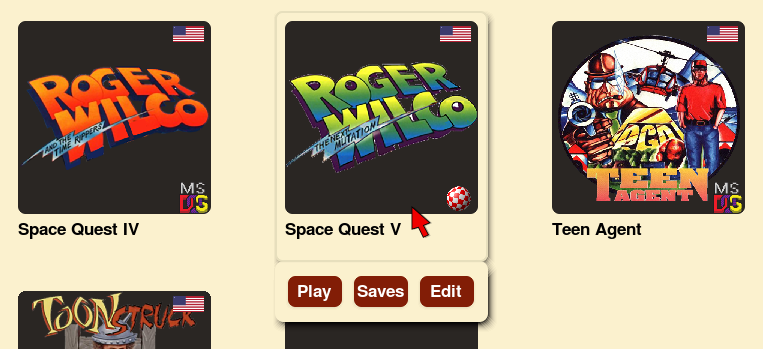
The above image shows few additions :-
- A highlight on hovering over a grid item.
- Language display replaced by flags.
- A “tray” dialog that appears below the entry to perform the most common actions. Icons can later be placed instead of words.
In other news…
I got a new AC for my room ?.