GSoC: ScummVM site new look

I’ve posted this picture on IRC yesterday:

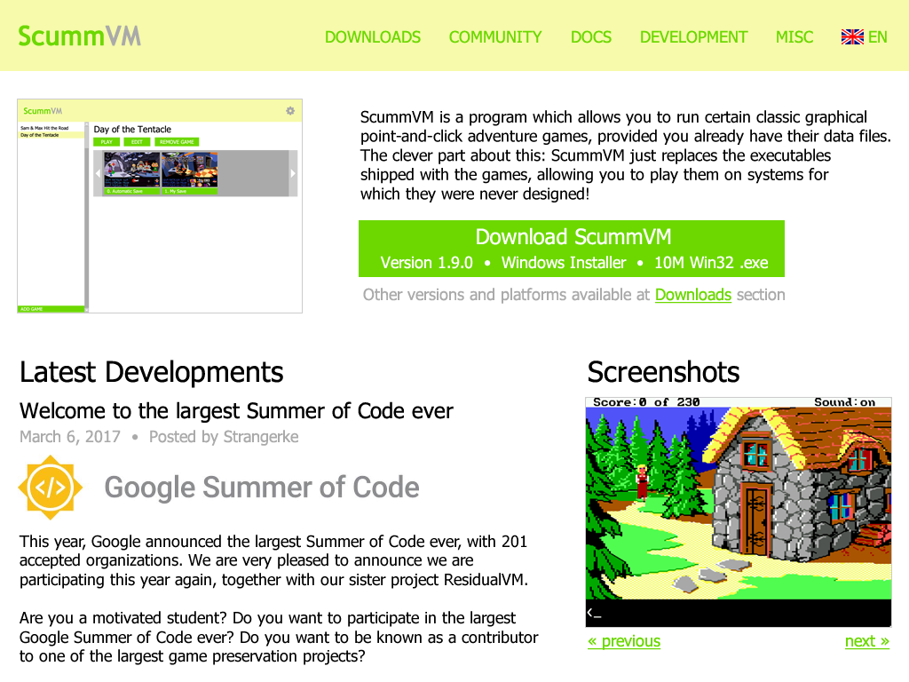
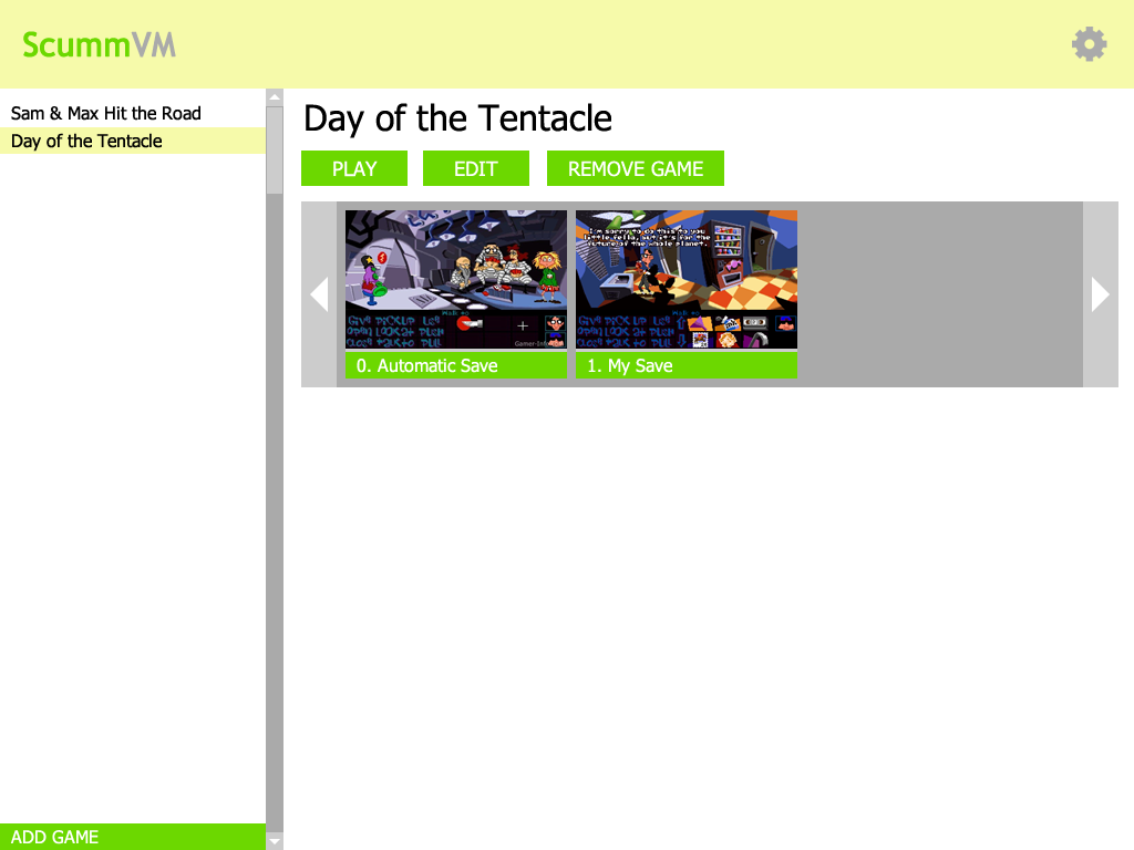
It inherits that green/white scheme of mine. The navigation menu from the side moved in dropdown lists on the top panel. ScummVM description is a bit shorter, shows an actual application screenshot and calls to download the newest version. Then goes the two-column layout, and the right column can contain not only screenshots section, but also Contribute and Donate sections.

Making of logotype & color scheme

As my original idea was to make a clean minimalistic look, not to change familiar colors, let me show you how exactly I came to what I have now:

So, let’s try designing a logotype!

Step 0. Open an editor.

Step 1. OK, what’s the most important part of ScummVM logo? Green “Scumm” and gray “VM” parts, for sure! As we’re trying to achieve the minimalistic look, borders and stuff would be left out:

Looks good for me!

Step 2. So, the other part of logo is background color, which is familiar ScummVM orange:

Oh. Probably gradients did all the job. Or the borders. May be try different tones?

Not really better.

Step 3. OK, so they say that you could make a solid color scheme not only of complementary colors, but also of analogous. Let’s try replacing orange with green:

Hey, it’s not that bad. And it’s not exactly green, it has some yellow tones in it. The closest to orange I could achieve =)

GSoC: ScummVM new look (idea)

Recently I’ve thought to try designing a new fresh look for ScummVM. This is what I came up with:

As you might’ve noticed, it’s a little bit inspired by Steam: games listed on the left and current game displayed on the right. Saves are available right from the very first screen.

Options dialog stayed pretty much the same, but tabs are replaced with a list. That allows to add more tabs without any scrolling and makes it look similar to main screen.

I was unable to add the familiar orange color into this scheme without ruining it, so I replaced it with pale green. The whole look is kind of minimalistic: no gradients, borders, rounded angles and such. The similar approach could be used to redesign ScummVM site.

These sketches show a 1024×768 desktop look, while not doing anything about platforms with smaller resolutions. I think it’s OK to go with a simple skin for those, meaning the layout stays the same and only the colors/fonts/images change.

I worked with ScummVM GUI system, so AFAIK it wouldn’t be too hard to change those layouts to correspond these sketches. That couldn’t be achieved with a simple skin, because some minor changes needed to place saves dialog in main dialog or to replace tabs with a list.

P.S. It’s not about GSoC, but my site is configured to show only those posts which has “GSoC” prefix in the RSS feed Planet is aggregating.