Continued from the previous entry.
Let’s take stock of the current state of the text positioning changes after the last blog post. First, let’s look at the differences in the set wed when Guybrush says “There’s an enemy pirate fighting over there.”:
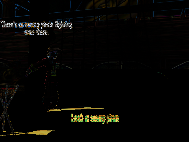
With the changes from before, we can see that there is less difference than when we started, but that the text for Guybrush’s speech bubble is positioned to the right by 1 pixel and towards the bottom by 5 pixels. Likewise, the text for “Look at enemy pirate” is closer, but still not quite right. It appears to be 11 pixels too high, towards the top compared to the retail version.
Another place with a similar issue is the text at the top of the inventory. It appears that the text is drawn 12 pixels too high, resulting in this difference:
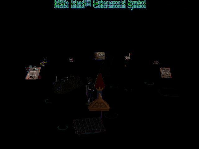
As an aside, the differences in object rotation in the inventory appear to be related to be related to the rotation and attachment work I’ve been blogging about. That work wasn’t in this branch when I took the screen shot!
Anyway, there’s definitely a problem with the placement of text on the Y axis, with a similar problem displayed in both sets. As it turns out, there’s code that specifically moves the text in the Y direction by 12 pixels in ResidualVM. This code is found in textobject.cpp and appears to have been added with this commit. Commenting out this adjustment results in the text for the inventory being placed in the correct location and bringing the command line in the set wed within 1 pixel of the correct location. Let’s take a new screen shot with this change:
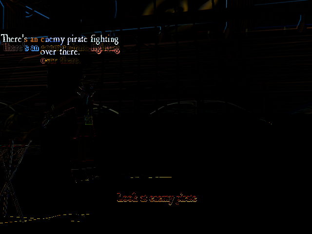
As can be seen, the action sentence at the bottom is very nearly correct and only off by one pixel. However, the speech bubble got worse. Now, the ResidualVM text is still 1 pixel to the right, but 17 pixels lower than it should be.
My first thought was that there was simply a blank line inserted below the text, but the font height for EMI was 26 pixels, not 17. I next checked the bounding boxes for the actors to see if they made sense by drawing a green line around Guybrush representing the bounding box whenever he spoke. Here’s what the output of that was:
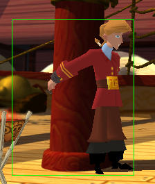
However, in order to get the bounding box to draw properly, I had to subtract the Y components from 480. In order to make the code simpler, I removed the subtraction from the Y component when computing the bounding box from the bounding box calculation and re-ran the test. Here’s the result after modifying the bounding box code:

Although the bounding box looks a little worse (see: Guybrush’s feet and hair), I checked the text position with this new bounding box and found that it was off by 26 pixels, which if you remember, was the height of the font. Subtracting 1 from the number of lines that the text was pushed up by gets the fonts for this scene rendered very closely to the original:

We can see that the fonts are still off by 1, but for now, this is close enough! So, let’s check to see if there are problems in other scenes. Unfortunately, there are:
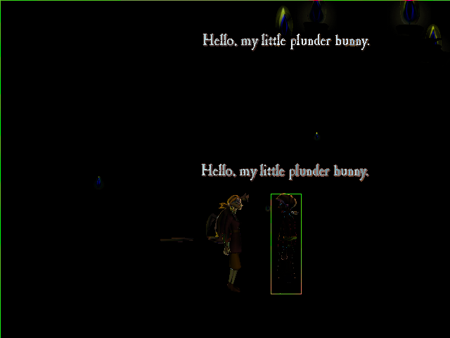
Here, you can see that Guybrush’s speech is rendered at the wrong place in the set gmi.
As a check, I also tried this branch with Grim Fandango and found that it too had fonts drawn too low, with text 13 pixels too low and offset by 2 pixels to the right for the top line and 1 for the bottom line:
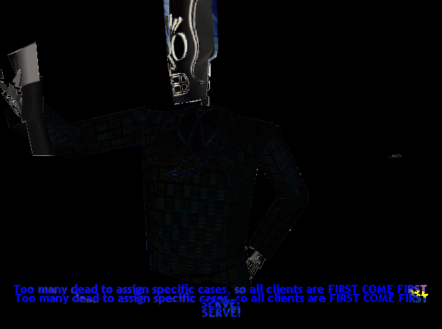
As an aside, bgK also tested this with the French version of Grim, which was reported to be problematic with using the kerned font sizes. I’m happy to say that the crashing issues from that appear to be resolved!
In the next blog post, we’ll take a look at these two issues and see if we can resolve them.